How does avant-garde designs by IA LONDON brand translate in colours, and design the confusion of mental chaos? How does human intelligence make Ira Iceberg creative during London Fashion Week in February 2020?
For me, London Fashion Week in February 2020 was a season for thoughtful attention to design. However, advanced ideas continue to surprise me around. Above all, digitally printed paintings, by the avant-garde designer IA London, Ira Iceberg captured my imagination. Likewise, I couldn’t resist myself from waiting to explore the new avant-garde designs.
Firstly, how does a theatrical presentation begin to change our idea of what is natural, and how human intelligence makes us creative? Secondly, how does an avant-garde designer translate in colours, and design the confusion of mental chaos? Let’s discover it now.
What is the history of the word Bedlam, how it is used today? Stop and think now: Afterwards, How does mental health inspire Ira Iceberg’s avant-garde design? The top latest idea of London Fashion Week to discover.
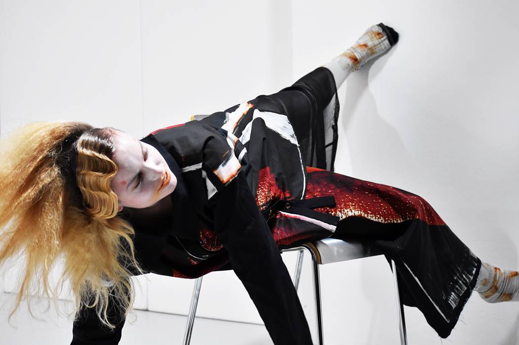
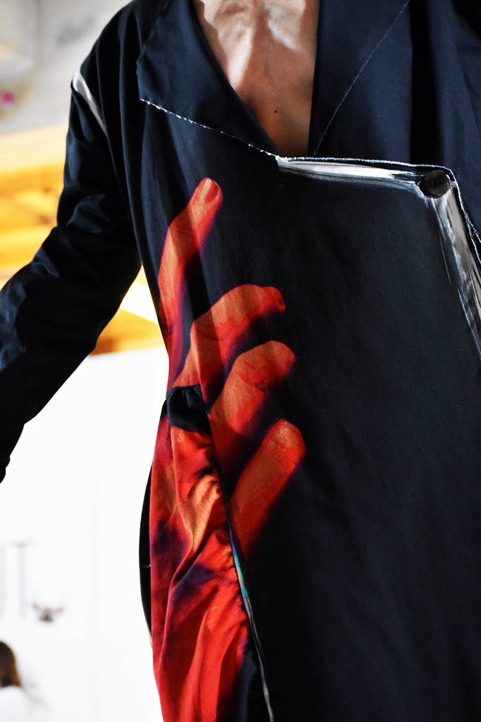
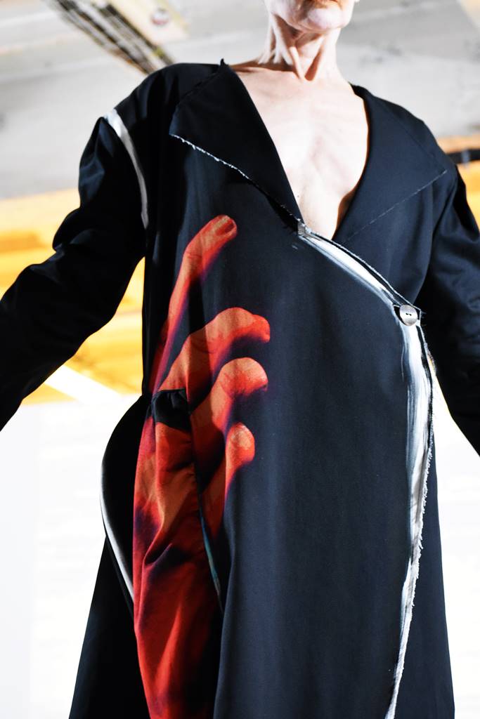
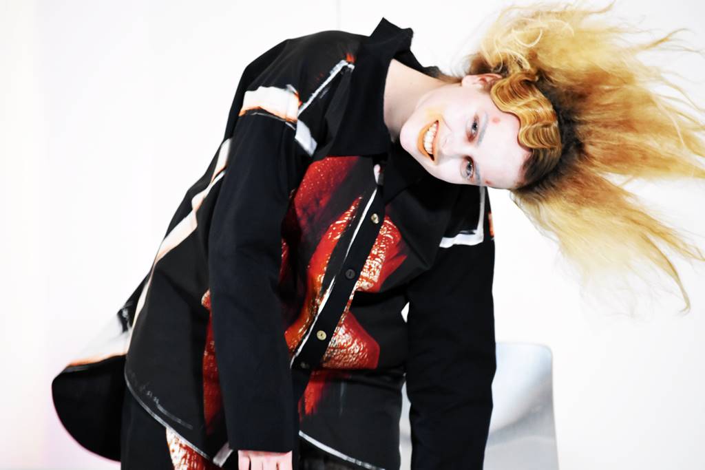
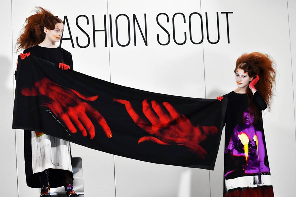
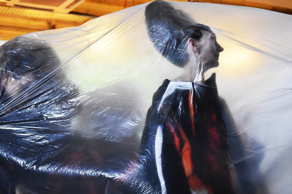
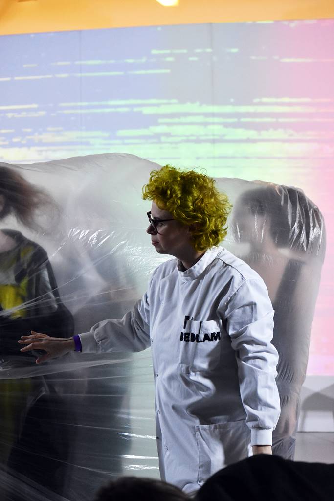
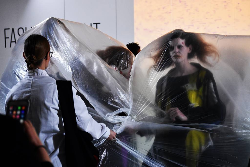
Bedlam, the Autumn/Winter 2020 collection of IA London, is an honour to Alexander McQueen. The word bedlam came about as a contraction of the name of the oldest psychiatric hospital in the world, the Bethlem Royal Hospital. However, today Bedlam is a scene of madness, chaos or great confusion.
Ira Iceberg took inspiration from Ken Kesey’s novel “One Flew Over The Cuckoo’s Nest” a film about patients treatments in asylums. In the same vein, combining psychological research on emotions of patients who attended the infamous Bedlam, the designer creates a new digital printed world with emotions and personality. In short, It’s about personal interaction through colour. Fashion make connections and help the designer make the pattern, and colour decision. Most importantly, to visualize a collection in a way with unlimited possibilities for creation.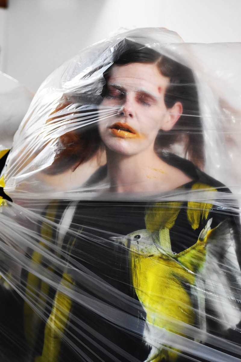
 Who is already the avant-garde designer Ira Iceberg of IA LONDON brand? Finally, How does London Fashion Week support the best emerging talents in fashion today?
 Who is already the avant-garde designer Ira Iceberg of IA LONDON brand? Finally, How does London Fashion Week support the best emerging talents in fashion today?
IA LONDON is a British Award-winning Avantgarde fashion brand, integrating art with fashion. A series of original artworks, created by the founder, hand-painted digitally directly on the pattern, define their distinctive appearance.
Firstly, IA London was founded in 2017 by Cambridge-based designer Ira Iceberg. Secondly, the designer received a prestigious ONE TO WATCH AWARD only a year after its first runway appearance. In conclusion, the award, by the iconic Fashion Scout, resulted in the acclaimed Runway Show SS20, under the socially-aware concept “I’m Bias-Blind”.
Meanwhile, On/Off London well known for discovering the best of emerging talents supported the Runway shows SS19 and AW19. Diversity and inclusiveness is the brand’s ethos.
How does yellow colour can perfectly showcase Iceberg’s technical expertise in digitally printed paintings? Afterwards, Which are today the top 3 colours to mix them up at Autumn/Winter 2020 collection of IA LONDON?
Every season during London Fashion week, I begin my experiment with colours by exploring them in the pure inspiration of the designer’s collection. In my eyes, colours need to be free from any association with form. In short, my motto during London Fashion Week is: Stay open to imagine, to create, to explore the dynamic of colour mixture. On the other hand, I enjoyed the surprise of what happens when the complexity of the human mind meets art. Then colours are placed in a different order.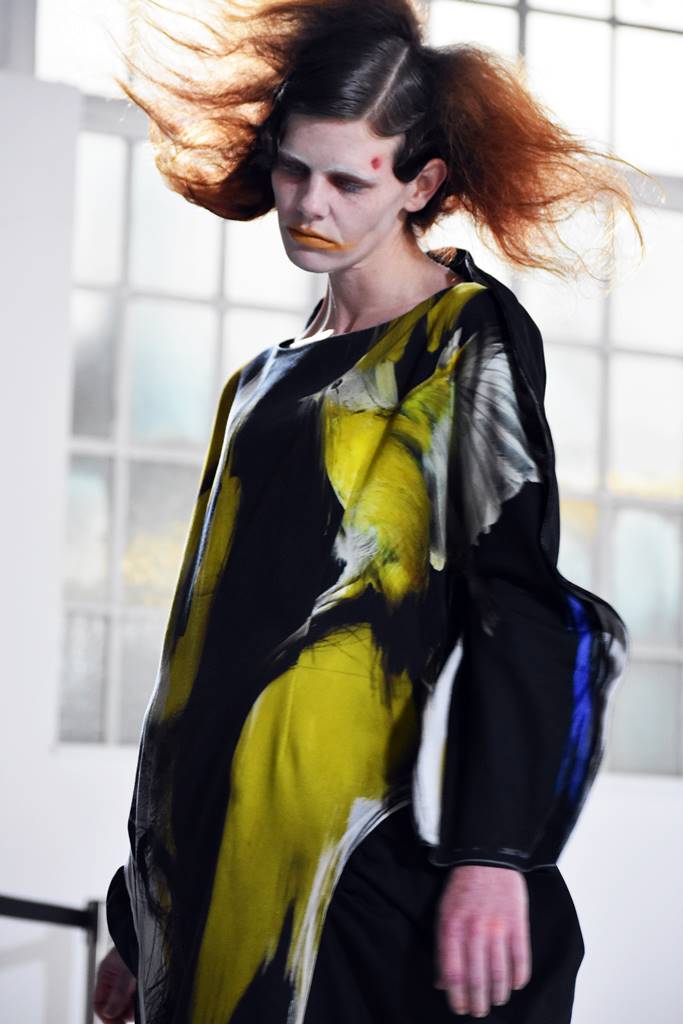
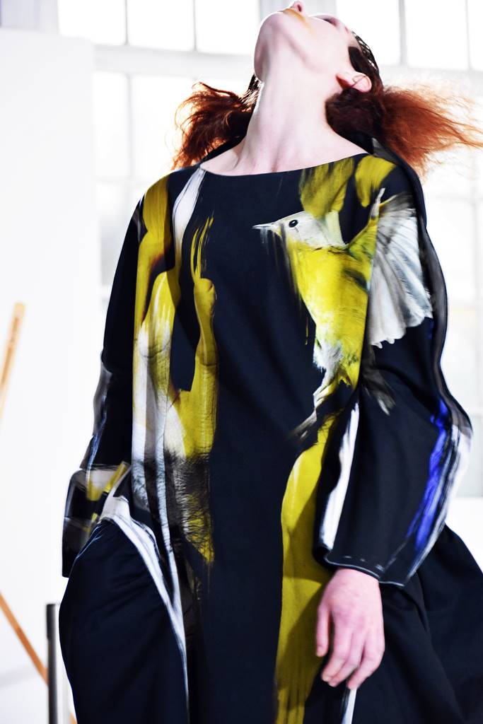
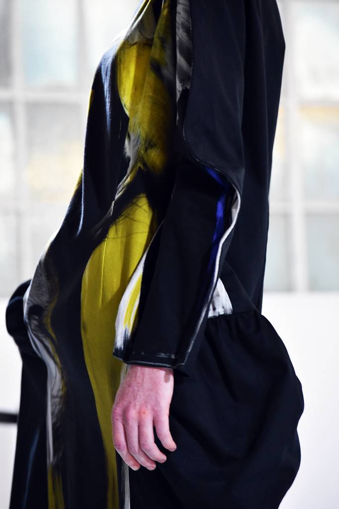
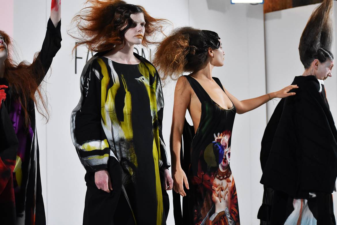
In the same vein, looking at IA London’s Autumn/Winter 2020 avant-garde designs, I consider new colours in an accidental union. Firstly, darks become a vital base with the emphasis being on the mixture with brights. Meanwhile, the darkest shades have a unique identity in the avant-garde designs of Ira Iceberg. Let’s explore now her dynamic sculptural shapes, her deconstructed art, and let your imagination free to mix them up with yellow shades that perfectly showcase Iceberg’s technical expertise in digitally printed paintings.
♦Re-birth, re-discover naturals through avant-garde designs: Open your eyes and see.
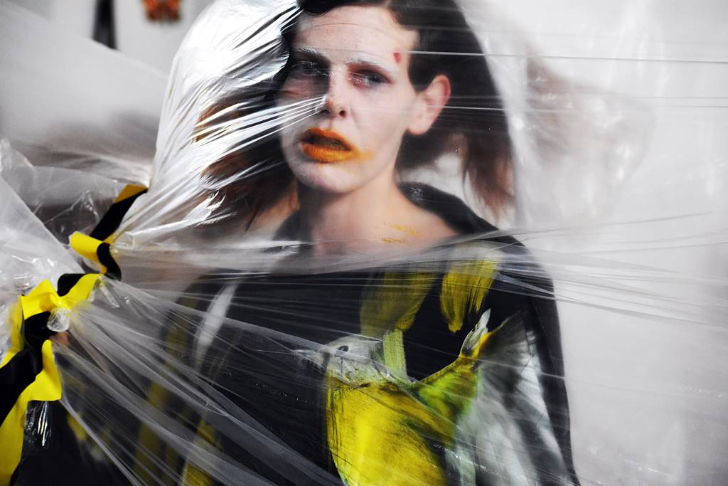
Earthy colours like cocoa brown, honey mustard, grey, white, and dark asphalt inspire the vibrant shade of yellow. It is about warm colours ready to embrace yellow, and create an uncomplicated look and feel. Ira Iceberg provides a neutral base for Autumn/ Winter 2020. Undoubtedly, naturals will add natural highlights in every look within the theme of darks.
♦Connect now yellows with mauve colour. Define today The most captivating Top latest surprise for A/W 21 pastels.
Neutral tones of mauve add a joyful brightness to yellow colour. A sense of calm inspires the contrast of cooler tones of darks with pastels. However, we are in the quest of relaxed winter looks. Mauve colour offers a warm contrast to the cooler tones of black, and red. Above all, Yellow is becoming a warm contrast to pastels and darks.
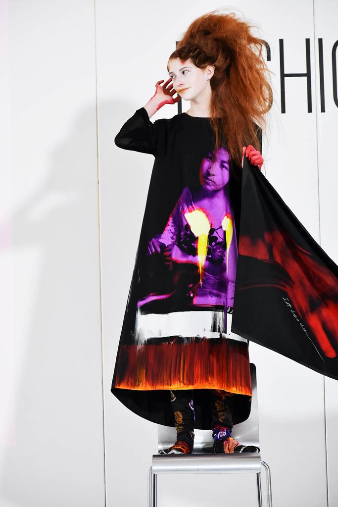
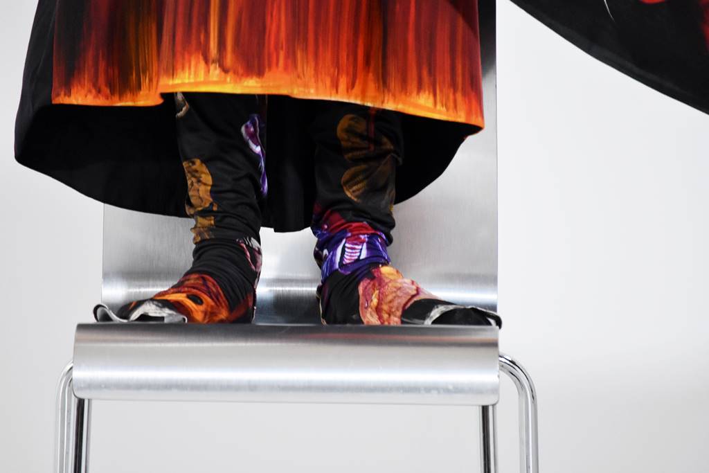
♦The revolution of RED. Forever the best colour for strong emotions. Dare to wear it.
The complexity of the human mind inspires a diverse palette of red colour for the season ahead. Ira Iceberg, think about red as an accent to orange, asphalte grey, white, and yellow. Afterwards, Metaphors for human feelings affirm a desire for a profound transformation. I feel that the bright tones of red secretly embrace calm, warm tones. Finally, red is the best moment of strong emotions.